
Understanding Responsive Design Benefits for Businesses

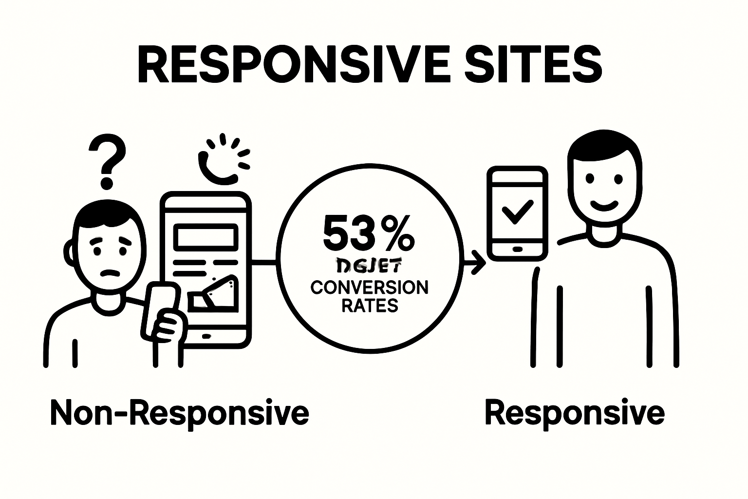
Responsive design shapes how every website looks and feels on your phone, tablet, or laptop. People often assume having a site that shrinks to fit a mobile screen is enough. Yet studies show that websites with responsive design see up to 50 percent higher conversion rates compared to non-responsive sites . That means responsive design is not just a buzzword. It is a clear path to winning more customers and creating a smoother web experience for everyone.
Table of Contents
Quick Summary
| Takeaway | Explanation |
|---|---|
| Responsive design enhances user experience. | Adapting layouts for different devices leads to intuitive navigation and reduces user frustration. |
| It improves website SEO performance. | Mobile-friendly websites rank higher in search engines, driving more traffic and engagement. |
| Responsive design reduces operational costs. | By maintaining a single design, companies lower development and maintenance expenses significantly. |
| Mobile-first design optimizes performance. | Prioritizing mobile usability during development enhances loading speed and efficiency across all devices. |
| Consistent design builds brand recognition. | Maintaining visual coherence across platforms strengthens user trust and familiarity with the brand. |
What is Responsive Design and Why It Matters
Responsive design represents a strategic approach to web development that ensures websites function seamlessly across multiple devices and screen sizes. At its core, responsive design enables web pages to automatically adjust layout, images, and content to provide an optimal viewing experience whether accessed from a desktop computer, tablet, or smartphone.
Understanding the Core Principles
Responsive design is built on three fundamental technical principles that work together to create flexible web experiences:
- Fluid Grid Layout : Unlike traditional fixed-width designs, responsive websites use percentage-based measurements that proportionally resize content across different screen dimensions
- Flexible Media : Images and other media elements automatically scale and resize to fit various display sizes without losing quality or visual integrity
- CSS Media Queries : These specialized CSS techniques allow websites to apply different styling rules based on specific device characteristics like screen width, resolution, and orientation
The Business Impact of Responsive Design
Adopting responsive design isn’t just a technical choice—it’s a strategic business decision with significant implications. According to W3C Web Accessibility Initiative , responsive design directly contributes to improved user experience, increased engagement, and better search engine performance.
Businesses implementing responsive design can expect tangible benefits such as:
- Expanded audience reach across multiple device types
- Improved website loading speeds
- Enhanced search engine optimization (SEO) performance
- Simplified website management by maintaining a single design
- Higher conversion rates due to consistent user experience
Modern web users demand seamless digital experiences. Responsive design provides the technical framework to meet these expectations, transforming how businesses communicate and interact with their online audience.
The following table summarizes the core technical and business features of responsive design, providing a quick reference for their distinct contributions.
| Feature / Principle | Technical Aspect | Business Impact |
|---|---|---|
| Fluid Grid Layout | Uses percentages for flexible sizing | Seamless experience across devices |
| Flexible Media | Images and media auto-resize | Maintains visual integrity and brand consistency |
| CSS Media Queries | Device-specific styling rules | Efficient adaptation to user technology |
| Single URL Structure | One website for all devices | Simplifies site management, boosts SEO |
| Simplified Updates | Unified content updates | Reduces operational and maintenance costs |
| Adaptive Navigation | Menus and content adapt to device & touch | Enhances user engagement and ease of use |
| Accessibility Support | Supports assistive technology & readability | Expands reach to broader, diverse audiences |
Key Benefits of Responsive Design for Your Business
Responsive design transcends mere technical innovation. It represents a strategic approach that directly impacts business performance, customer engagement, and digital competitiveness. By creating adaptable web experiences, companies can unlock significant advantages that translate into tangible business outcomes.
Enhanced User Experience and Engagement
Customer experience is the cornerstone of digital success. Responsive design ensures that users have a seamless, intuitive interaction with your website regardless of their device. Our SEO strategies guide highlights how consistent user experience directly correlates with increased engagement and reduced bounce rates.
Key advantages include:
- Consistent visual presentation across smartphones, tablets, and desktops
- Reduced user frustration through intuitive navigation
- Faster page load times on mobile devices
- Improved accessibility for users with diverse technological capabilities
Significant Search Engine Performance Boost
Search engines like Google prioritize mobile-friendly websites in their ranking algorithms. According to University of Texas Web Accessibility Research , responsive design provides substantial SEO advantages by:
- Creating a single URL for all device types
- Reducing duplicate content issues
- Improving site load speed
- Enhancing overall website crawlability
- Signaling technical competence to search algorithms
Cost-Effective Digital Strategy
Implementing responsive design offers profound economic benefits for businesses. Rather than maintaining multiple website versions, companies can develop a single, adaptable digital platform. This approach reduces development costs, simplifies content management, and provides a unified brand experience.
Businesses adopting responsive design can expect:
- Lower long-term web development expenses
- Simplified content update processes
- Reduced maintenance overhead
- Faster time-to-market for digital initiatives
- Improved return on digital investment
Responsive design is no longer a luxury but a fundamental requirement for businesses seeking digital relevance and competitive advantage.
How Responsive Design Improves User Experience
Responsive design fundamentally transforms how users interact with digital content across different devices. By creating adaptable interfaces that automatically adjust to various screen sizes and orientations, businesses can deliver seamless and intuitive digital experiences that meet modern user expectations.
Adaptive Navigation and Content Presentation
User experience relies heavily on intuitive navigation and content accessibility. Responsive design solves this challenge by dynamically reformatting website layouts to ensure optimal readability and interaction. According to National Center for Biotechnology Information Research , this approach eliminates user frustrations associated with traditional static websites.
Key navigation improvements include:
- Automatically resizing menus for touch-friendly interactions
- Collapsible navigation elements for smaller screens
- Proportional text sizing for enhanced readability
- Simplified touch targets for mobile users
Consistent Visual Experience Across Devices
Responsive design creates a unified brand experience by maintaining consistent visual elements regardless of device type. This approach ensures that images, typography, and color schemes remain cohesive, helping businesses build strong brand recognition and user trust.
Important visual consistency factors include:
- Proportional image scaling
- Fluid grid layouts that adapt seamlessly
- Consistent color palettes and typography
- Preserved design hierarchy across different screen sizes
Accessibility and Inclusive Design
Beyond visual appeal, responsive design plays a crucial role in digital accessibility. Tufts University accessibility research highlights how adaptable interfaces support users with diverse technological capabilities and potential disabilities.
Accessibility advantages encompass:
- Support for screen readers and assistive technologies
- Improved text legibility across devices
- Enhanced keyboard and touch navigation
- Compatibility with various browser and device configurations
Responsive design transforms user experience from a technical challenge into a strategic opportunity for businesses to connect meaningfully with their digital audience.

Understanding Mobile-First and Its Impact
Mobile-first design represents a revolutionary approach to digital strategy that prioritizes mobile device experiences during the initial stages of website and application development. This methodology fundamentally shifts how businesses conceptualize and create digital interfaces, ensuring optimal performance across increasingly diverse technological landscapes.
The Philosophy Behind Mobile-First Design
Traditionally, web designers created websites for desktop platforms and then adapted them for mobile devices. Mobile-first design inverts this approach, beginning with mobile experience as the primary consideration. Interaction Design Foundation emphasizes that this strategy ensures websites are crafted with mobile constraints and capabilities at the forefront of design thinking.
Key principles of mobile-first design include:
- Prioritizing content relevance and simplicity
- Designing for smaller screen sizes initially
- Focusing on core user needs and interactions
- Eliminating unnecessary design elements
Technical Advantages and Performance Optimization
Mobile-first design delivers significant technical benefits beyond visual aesthetics. By constraining design to mobile specifications, developers are compelled to optimize website performance, reduce unnecessary code, and create more efficient digital experiences. This approach naturally leads to faster loading times, reduced bandwidth consumption, and improved overall user experience.
Performance optimization strategies encompass:
- Minimizing complex CSS and JavaScript
- Using lightweight, responsive images
- Implementing efficient navigation structures
- Reducing server-side processing requirements
Business and SEO Implications
Adopting a mobile-first approach directly impacts business digital strategy. According to Tufts University Accessibility Research , businesses implementing mobile-first design can expect improved search engine rankings, broader audience reach, and reduced website maintenance costs.
Strategic business advantages include:
- Enhanced visibility in search engine results
- Improved user engagement across devices
- Lower development and maintenance expenses
- Increased conversion rates through optimized experiences
Mobile-first design is not merely a trend but a fundamental reimagining of how businesses communicate and interact with their digital audience.
Below is a comparison table outlining the main differences between traditional desktop-first design and mobile-first responsive design as discussed in the article.
| Approach | Design Starting Point | Content Prioritization | Performance Focus | Business & SEO Advantages |
|---|---|---|---|---|
| Desktop-First | Desktop screen sizes | Broad feature set, then trim | Often larger, slower on mobile | May lag on mobile SEO and reach |
| Mobile-First (Responsive) | Mobile screen sizes | Core content and simplicity | Lean, optimized for all devices | Higher rankings, broader audience, lower cost |
Real-World Examples of Responsive Design Success
Responsive design has transformed digital experiences across industries, demonstrating its powerful capacity to enhance user engagement, streamline business processes, and drive organizational innovation. By examining successful implementations, businesses can understand the tangible benefits of adaptive digital strategies.
E-Commerce Transformation
Retail giants have leveraged responsive design to revolutionize online shopping experiences. Companies like Amazon and Shopify have implemented adaptive interfaces that dynamically adjust product displays, checkout processes, and navigation based on user device characteristics. According to Enterprise Architecture Research , these implementations directly correlate with increased conversion rates and improved customer satisfaction.
Key e-commerce responsive design achievements include:
- Seamless product visualization across devices
- Simplified mobile checkout processes
- Adaptive pricing and promotional displays
- Personalized shopping experiences
Media and Content Platforms
News organizations and content platforms have dramatically improved user engagement through responsive design. Websites like BBC News and Medium have created flexible layouts that preserve content readability and visual hierarchy across smartphones, tablets, and desktop computers.
Content platform responsive design innovations feature:
- Adaptive text sizing and column configurations
- Touch-friendly interactive elements
- Optimized image and video embedding
- Consistent brand experience across platforms
Enterprise and Professional Services
Business-to-business platforms and professional service websites have embraced responsive design to enhance communication and user interaction. These digital interfaces now provide seamless access to complex information, documentation, and service offerings across multiple device types.
Enterprise responsive design advantages include:
- Consistent presentation of technical documentation
- Accessible corporate communication channels
- Simplified navigation for complex information architectures
- Enhanced remote collaboration capabilities
Responsive design is no longer an optional feature but a critical component of modern digital strategy, enabling businesses to deliver exceptional user experiences regardless of technological constraints.
Unlock Responsive Design to Accelerate Your Business Growth in Canada
Your business deserves more than just a stunning website. In today’s world, customers expect seamless experiences across every device. Without a responsive design, your site can frustrate users, hurt your search rankings, and lead to missed leads. Our recent article explained how responsive design improves user engagement, site speed, and conversion rates by providing fluid layouts and mobile-first solutions. But knowledge is only the first step. Real results require expert implementation that bridges digital strategy with local success.

Take action now to give your business the digital edge it deserves. Partner with our team of Canadian experts to transform your website into a responsive, high-performing powerhouse. Let us help you improve your online presence, boost your local SEO and attract more customers with proven, full-service solutions. Start by exploring how our specialized website and landing page builds can deliver fast and measurable results. Visit Freedom SEO and see how a responsive strategy can put you ahead of your competition. Book your free consultation today and let’s get your business ranking in the top 3 on Google.
Frequently Asked Questions
What is responsive design?
Responsive design is a web development approach that ensures websites function seamlessly across various devices and screen sizes. It automatically adjusts the layout, images, and content for optimal viewing on desktops, tablets, and smartphones.
How does responsive design improve user experience?
Responsive design enhances user experience by ensuring a consistent visual presentation, reducing user frustration with intuitive navigation, and enabling faster page loading times. This creates a seamless interaction, regardless of the device being used.
What are the key benefits of implementing responsive design for businesses?
Key benefits of responsive design for businesses include expanded audience reach, improved SEO performance, reduced development costs, increased conversion rates, and simpler content management by maintaining a single adaptable site.
Why is mobile-first design important in responsive design?
Mobile-first design prioritizes the user experience on mobile devices during the initial stages of design. This approach leads to better performance optimization, improved search engine rankings, and broader audience reach, making it a strategic advantage for businesses.
Recommended