
Understanding the Importance of a Mobile Friendly Website

Most people think a mobile friendly website is just about making things look good on a phone, and that sounds simple. Not so fast. Over 53 percent of visitors will leave your site if it takes more than three seconds to load on their mobile device. Turns out, how your website works on a mobile screen could decide if your business even gets seen at all.
Table of Contents
Quick Summary
| Takeaway | Explanation |
|---|---|
| Mobile friendly is essential for websites | A mobile friendly website is crucial for user retention and engagement in today’s mobile-centric world. |
| Responsive design improves user experience | Responsive design enables seamless viewing and interaction across different devices, enhancing usability. |
| Fast loading times are critical | Websites must load quickly; 53% of mobile users leave if a page takes longer than three seconds. |
| Mobile optimization impacts SEO rankings | Search engines prioritize mobile friendly websites, which improves visibility and search result positioning. |
| User-friendly design fosters customer trust | A well-designed mobile experience builds customer confidence and can lead to higher conversion rates. |
What is a Mobile Friendly Website?
A mobile friendly website is a digital platform designed to provide an optimal viewing and interaction experience across various mobile devices. Unlike traditional websites that might appear distorted or difficult to navigate on smaller screens, mobile friendly websites automatically adjust their layout, content, and functionality to ensure seamless usability.
The Core Elements of Mobile Friendliness
Mobile friendly websites are characterized by several key technical and design features that enhance user experience. These include:
- Responsive Design : A flexible layout that automatically resizes and restructures content based on the device’s screen size
- Touch-Friendly Navigation : Large, easily tappable buttons and intuitive menu structures
- Fast Loading Times : Optimized images and streamlined code that enable quick page rendering
According to WebAIM , mobile friendly design is not just about visual appearance, but about creating an accessible and functional digital experience that serves users effectively across different devices.
Understanding Responsive Technology
Responsive web design uses fluid grid layouts, flexible images, and CSS media queries to create websites that dynamically adapt to different screen sizes. This means a single website can look and function perfectly whether viewed on a smartphone, tablet, or desktop computer.
The fundamental goal of a mobile friendly website is to eliminate the need for users to resize, pan, or scroll horizontally to read content. By prioritizing readability, navigation ease, and performance, businesses can create digital experiences that engage and retain mobile users effectively.
To clarify the essential attributes of mobile friendly websites, here is a breakdown of their core features and the advantages each one brings for users and businesses.
| Feature | Description | Benefit for Users/Businesses |
|---|---|---|
| Responsive Design | Layout adapts to any device or screen size | Ensures seamless viewing and interaction |
| Touch-Friendly Navigation | Large buttons and intuitive menu structures | Reduces navigation friction |
| Fast Loading Times | Optimized images and code enable quick page rendering | Decreases bounce rates, improves retention |
| Readability | Text is legible without zooming or horizontal scrolling | Enhances user engagement |
| Performance Optimizations | Reduced file sizes and efficient code | Minimizes wait time for content |
| Accessibility | Works effectively for users with varying technology and needs | Broadens audience reach |
Key considerations for mobile friendliness include optimizing text size, ensuring buttons are appropriately spaced for touch interactions, and minimizing the need for excessive zooming or horizontal scrolling. These design principles not only improve user experience but also align with search engine optimization requirements, potentially boosting a website’s visibility and ranking.
Why Mobile Friendly Websites Matter for Businesses
In today’s digital landscape, businesses cannot afford to ignore mobile website design.
With increasing numbers of consumers accessing the internet through smartphones and tablets, a mobile friendly website has transformed from a luxury to an absolute necessity for competitive digital presence.
User Experience and Customer Engagement
Mobile friendly websites directly impact customer interaction and retention. When users encounter a website that does not render correctly on their mobile device, they are likely to abandon it within seconds. Research from Google reveals that 53% of mobile site visitors leave a page that takes longer than three seconds to load, highlighting the critical importance of mobile optimization.
Businesses benefit from mobile friendly websites through:
- Increased User Retention : Smooth, responsive design keeps visitors engaged
- Higher Conversion Rates : Easy navigation encourages users to complete transactions
- Improved Brand Perception : Professional mobile experiences build customer trust
Search Engine Ranking and Visibility
Search engines like Google prioritize mobile friendly websites in their ranking algorithms. This means businesses with responsive, mobile optimized sites are more likely to appear higher in search results, directly impacting online visibility and potential customer acquisition. Read more about mobile SEO strategies to understand how mobile design influences digital marketing success.
Moreover, mobile friendly websites are crucial for reaching broader audiences.
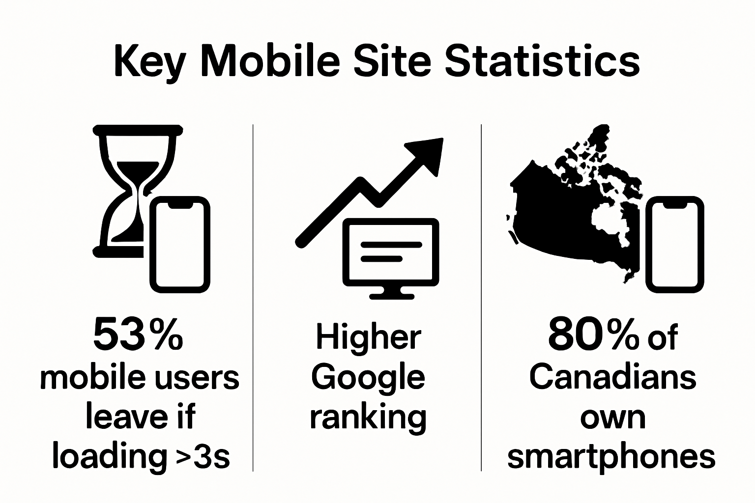 With over 80% of Canadians owning smartphones, businesses that neglect mobile optimization risk losing significant market share. A well-designed mobile website ensures that your digital storefront is accessible, functional, and appealing across all devices, ultimately driving business growth and customer engagement.
How Mobile Optimization Enhances User Experience
Mobile optimization is a strategic approach to digital design that transforms how users interact with websites across different devices. By prioritizing user needs and technological capabilities, businesses can create digital experiences that are intuitive, accessible, and engaging.
Designing for Seamless Interaction
Mobile optimization goes beyond simple screen resizing. It involves creating an entire user experience that anticipates and responds to how people use mobile devices. This means designing interfaces with touch interactions in mind, ensuring buttons are appropriately sized, navigation is straightforward, and content is easily consumable on smaller screens.
Key principles of mobile user experience include:
- Intuitive Navigation : Simplified menus and clear pathways through content
- Readability : Text that is legible without zooming or horizontal scrolling
- Performance : Quick loading times and smooth transitions between pages
According to Nielsen Norman Group , successful mobile optimization requires understanding user behavior and technological constraints, creating experiences that feel natural and effortless.
Performance and Accessibility Considerations
Mobile optimization directly impacts website performance and user accessibility. Websites that load quickly and function smoothly across different devices reduce user frustration and increase engagement. Learn more about responsive design strategies to create more inclusive digital experiences.
Additionally, mobile optimization supports broader accessibility goals. By designing websites that work effectively on various devices and screen sizes, businesses can reach wider audiences, including users with different technological capabilities and accessibility needs. This approach not only improves user experience but also demonstrates a commitment to inclusive digital design.
Key Features of Mobile Friendly Websites
Mobile friendly websites are distinguished by sophisticated design elements that ensure seamless user interaction across diverse digital devices. These features go beyond simple visual adaptations, creating comprehensive digital experiences that prioritize functionality, accessibility, and user engagement.
Responsive Design Architecture
The foundation of a mobile friendly website lies in its responsive design architecture. This technical approach enables websites to dynamically adjust layout, content, and functionality based on the specific device screen size. Responsive design ensures that whether a user accesses the site from a smartphone, tablet, or desktop computer, the experience remains consistent and intuitive.
Critical responsive design components include:
- Fluid Grid Systems : Layouts that proportionally resize content
- Flexible Image Scaling : Graphics that adapt without losing quality
- Media Query Implementation : CSS techniques that detect device characteristics
Understanding mobile first indexing becomes crucial in implementing these responsive design strategies effectively.
Technical Performance Optimization
According to Usability.gov , mobile friendly websites must deliver exceptional technical performance. This means creating digital platforms that load quickly, consume minimal data, and provide smooth navigation without frustrating delays.
Key performance optimization strategies include minimizing large image files, leveraging browser caching, and reducing server response times. These technical refinements ensure that mobile users experience fast, efficient website interactions, which directly correlates with higher user retention and engagement rates.
Ultimately, mobile friendly websites represent a holistic approach to digital design that transcends traditional web development. By integrating sophisticated technical capabilities with user-centric design principles, businesses can create digital experiences that are not just accessible, but truly compelling across all devices.

The Impact of Mobile Friendliness on SEO and Business Growth
Mobile friendliness has become a critical determinant of online success, directly influencing search engine rankings, user engagement, and ultimately business growth. As digital platforms continue to evolve, businesses must recognize the profound connection between mobile optimization and their digital performance.
Search Engine Ranking Dynamics
Search engines like Google have fundamentally transformed their algorithms to prioritize mobile friendly websites. This shift means that mobile optimization is no longer an optional enhancement but a mandatory requirement for digital visibility. Websites that fail to provide a seamless mobile experience risk significant drops in search engine rankings, effectively becoming invisible to potential customers.
Key SEO implications of mobile friendliness include:
- Higher Search Result Placement : Mobile optimized sites receive preferential treatment
- Improved User Experience Metrics : Lower bounce rates signal quality content
- Enhanced Crawlability : Easier for search engines to index mobile responsive sites
Mobile first indexing strategies are essential for businesses seeking to maintain competitive digital positioning.
Business Growth and Customer Acquisition
According to Google’s research, 53% of mobile users abandon websites that take longer than three seconds to load. This statistic underscores the direct relationship between mobile optimization and potential revenue loss. A mobile friendly website acts as a critical touchpoint for customer acquisition, providing a smooth, intuitive interface that encourages engagement and conversion.
Businesses that invest in mobile optimization create digital experiences that not only attract customers but also build trust and credibility.
The table below highlights the impact of key mobile optimization strategies on SEO performance and business outcomes, helping businesses understand the relationship between mobile website design, search engine rankings, and growth.
| Mobile Optimization Strategy | SEO Impact | Business Outcome |
|---|---|---|
| Responsive Design | Higher placement in mobile search results | Greater online visibility |
| Fast Loading Times | Lower bounce rates, improved rankings | Increased conversions and retention |
| Mobile Friendly Navigation | Better crawlability by search engines | Enhanced customer trust and satisfaction |
| Performance and Accessibility | Favourable user experience metrics | Expanded audience and reduced barriers |
| Mobile First Indexing Readiness | Priority in mobile indexing by Google | Competitive digital positioning |
Turn Mobile Traffic Into Loyal Customers With Professional Website Optimization
Is your business missing out on customers because your website is difficult to use on a phone or tablet? The article highlighted how a mobile friendly website is not just about looking good, but about ensuring your visitors can easily navigate, read, and interact from any device. Struggling with slow loading times, unreadable text, or a clunky layout can leave users frustrated and cost your business valuable opportunities. If you want to retain visitors, boost conversions, and climb those Google rankings, having a responsive design is essential. Our team at Freedom SEO
specializes in building fast, responsive websites for Canadian businesses just like yours. We know what it takes to keep users engaged and help you get found online. Stop losing clients to competitors with smoother mobile websites. Get your custom, mobile optimized site delivered quickly, professionally, and with guaranteed results. Trust your business to the local experts at Freedom SEO. Ready to see real growth? Contact us today for your new website or landing page and let us guide you towards the top three spots on Google. Your mobile friendly, high-converting website is just a click away.
Frequently Asked Questions
What is a mobile friendly website?
A mobile friendly website is designed to provide an optimal viewing and interaction experience on mobile devices, ensuring that the layout and content adjust seamlessly to fit different screen sizes.
Why is mobile friendliness important for businesses?
Mobile friendliness is crucial for businesses because it directly impacts user engagement, conversion rates, and search engine rankings, leading to increased visibility and customer retention.
How does mobile optimization affect search engine rankings?
Search engines prioritize mobile friendly websites in their algorithms, meaning that sites with responsive design and fast loading times are more likely to rank higher in search results.
What are the key features of a mobile friendly website?
Key features of a mobile friendly website include responsive design, touch-friendly navigation, fast loading times, intuitive user experiences, and technical performance optimizations.
Recommended